3.What Kind Of Media Institution Might Distribute Your Product?
I think a suitable media institution for the distribution of my product would be IPC Media. Firstly because it is one of the major magazine distributors in the UK. Then has a lot of experience with magazines and people believe that it would represent only high quality projects. Furthermore, it distributes magazines like ''Rock Sound'' and ''Uncut'', which are similar to my magazine and have similar audience, although mine is slightly younger. However, as it distributes a lot of magazines, especially rock ones, it would be very difficult for mine to stand out.
My second choice is Bauer Media Group, because they distribute not only magazines, but a other things as well. Famous mags they represent are ''Q'' and ''Kerrang!''. However, this media institution also distributes a lot of rock magazines already.
The other major publishing companies have a different target audience than what I'm aiming for, so considering all the above I have decided to go for IPC Media.
- 4. Who Would Be The Audience For Your Media Product?
My target audience are young people, aged between 17 and 25, they are interested not only in the music but in it's background as well. They are fun and outgoing but like to think of themselves as individuals. They have a strong character and like to deal with their problems on their own. However, they sometimes feel insecure and need someone to talk to. They wan't the truth, to know how things really are, not most of the non-sense that magazines provide. Considering all mentioned above, I think the concept of my magazine would meet their expectations.
5.How Did You Attract/Address Your Audience?
- Colours: bright and attractive
- Masthead:unusual
- Photo: eye-catching(the photo itself and the costume represents my target audience)
- The text on the cover: (famous rock bands+bright colours)
- Layout: at first sight usual, but has interesting parts and shapes.
6.What Have You Learnt About Technology From The Process Of Constructing This Product?
I have learnt a lot of things about technology in the process of creating my magazine. To be honest I knew very little about it. For example I've never used programs like Photoshop, or created a blog before.
I've also learnt that technology plays a huge role in the publishing, distributing and advertising a magazine.
I used the site www.blogger.com for creating my blog.

Then for my main task I used Photoshop for creating my backgrounds and pictures + my front cover and the contents page.
Then used Microsoft Publisher for creating my double page spread.

For my Evaluation I used presentations from Prezi.
.jpg)
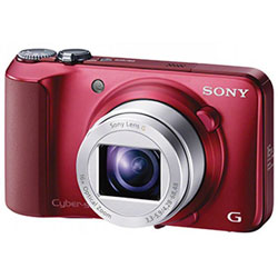
I used a Sony camera for taking my pictures.

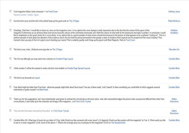
I also used Facebook for getting some of my audience feedback and advertising my magazine.

7. Looking Back At Your Preliminary Task(School Magazine Task), What Do You Think You Have Learnt In The Progression From It To Full Product?
I think I have learnt a lot in the process of creating my magazine. The difference is huge. Now I know how to use all different kinds of technology to express my ideas, I also know what is desirable from the audience and how importaint they are.


.jpg)
