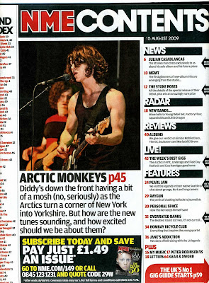
I've chosen this content page as an example, because it is simple and easy to understand.
The picture takes most of the page, which is unusual, but draws attention and says about the magazine more than the written part. From this page we understand that this is a music magazine and the things written in it are mainly about rock bands, which is what I'm aiming for as well.
The connotation of the person's clothes is interesting. He is wearing a tie and s shirt, but it seems like it is with irony. Including the goofy face expression and all the tattoos, it is another way of showing that there is no difference between me wearing suits and people in rock and punk bands, although many people seem to think different.
The way things are place on the paper reminds of the cover of the magazine: the photo on the left third of the page and the articles on the right side.
There is another thing added in the left bottom corner of the page, a quote from a person in one of the bands, perhaps the person from the picture. This always drags the audience's attention.
2nd content page

The content of this page has a clear layout, making it look interesting, appealing and containing a lot of information. The photo in the middle grabs the attention, especially the one of the fans of the band. The fact that the vocalist appears to be good looking could attract more female audience, despite that they are not usually targeted by these types of magazine. There is a short summary, giving a brief information about the content about the band, contained in this issue.
What is a magazine without adverts? There are plenty of them in this contents page; it is worth noting that in this case the magazine advertises itself, which is a convenient and cheep way of doing it.
At first site the page seems very modest; white background and black letters. This indicates the magazine is popular and well know enough to afford white spaces.
This contents page contains everything we would expect it to contain: news, features, albums and reviews. It is easy to follow and still looks interesting.
3rd contents page
Starting with the name of the magazine, ''Q'' is very well known and respectable, affording to advertise itself (at the upper right corner) and leave enough white space as background.
The colours are simple (white and red), which enables the content to stand out and focuses in the pictures.
The layout is eye catching because it usually takes just one page, here it has taken two. The written content is placed on the two outside thirds of the pages, while the pictures in the middle have numbers which link them to the written content. On the left page we see a list of the bands and artists mentioned in the magazine and on the right side is the information, listed under the name of ''Regulars'', which hints that it is something typical for the magazine and the fans would recognize it. There is also a review of the magazine at the bottom, giving more information about the issue.
The photos are difficult to miss, starting with the animated character above the number 44, which represents the specific style of the band ''Gorillaz''. The message it sends, besides the appearance of the band in these pages, could be interpreted in different ways, could be a political statement or something about war. In my eyes this represents the people, blinded by something (love, hate, greed) shooting without seeing at which direction or at who and the fact that the gun comes out if the character's mouth it could as well be a metaphor for words. Overall people blindly say things they shouldn't and hurt each other along the way.
The other thing that grabs the eye is the contrast between the black and white picture and the on below it, which is very colorful. The black and white one has a dramatic and serious look, whereas the other one has a more casual and rebellious one, they both appeal to a different audience, which gives the magazine a wider range of consumers.


